

I think that diagrammatic programming languages (and code, in general) should follow the "Rule of 7", i.e. layering, where no more than 7±2 semantically-interesting things appear on any layer, in hopes of reducing cognitive load for those reading the diagrams and code.
I liken this to a modernized version of "structured programming".
This train of thought leads to a simple extension for how message flows are routed, and, it requires fan-out. Both are trivial to implement using what we now know about programming, but, seemed difficult and "inefficient" due to thought-biases of the early days of computing.
This would let programmers construct components that contain nets of other components, kind of like /bin/*sh on steroids.
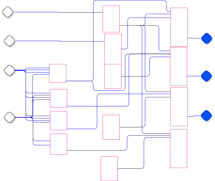
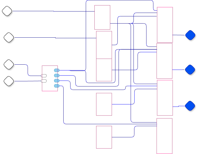
Example
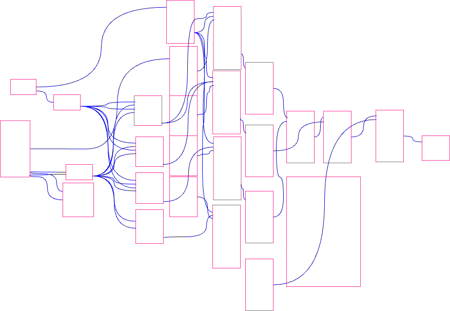
27 boxes
42 lines
What is semantically interesting in this diagram? Because this is intended to be a simple example, I’ve elided a lot of actual detail, leaving only graphical figures. It’s hard to tell if the rectangles have more importance than the connections, or if the lines have more importance than the rectangles, or some combination.
Also, it is facile to put a number - 7 - on this rule, but, it’s a start. The main idea is that the diagram should be layered, and, that each layer must make sense, and, that each layer must not overwhelm the reader with detail.
Right Angles And Prohibiting Lines From Crossing Rectangle Boundaries
The first thing to notice on this sketch, is that some lines cross the boundaries of some boxes.
That’s easy to fix.
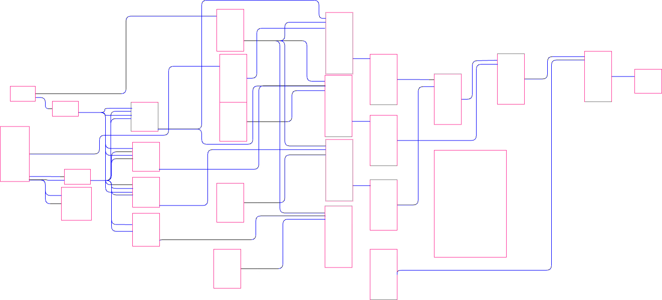
Designer-controlled, right-angled lines are used instead of machine-controlled, curvy lines. 50 years ago, electronic schematics used right-angled lines with sharp corners. Today, our editors can do better. We can use right-angled lines with rounded corners.
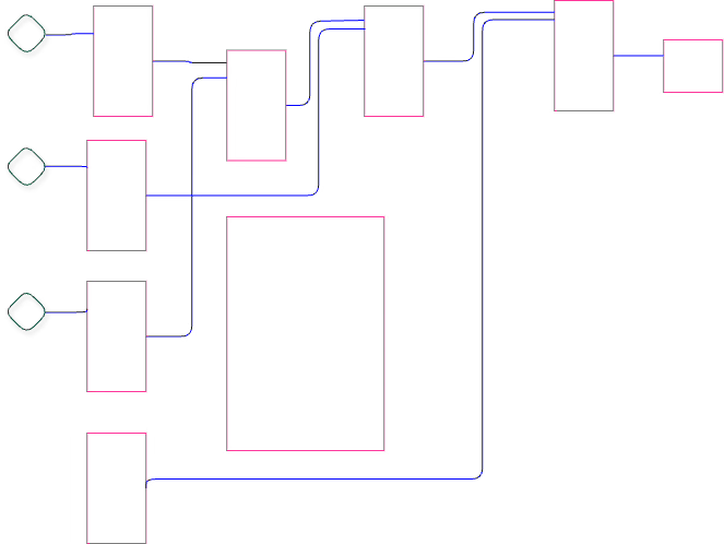
I redrew the diagram using right-angled, rounded lines and spacing components out to eliminate all rectangle boundary crossings.
Creating Layers
I see a section of the diagram that looks more complicated than the rest. I might be wrong, since I don’t actually know what the details of the design are and what parts of it the Software Architect thinks are important.
The goal is to strive for expressing Design Intent. What was the Software Architect thinking? Why was the problem solved this way instead of using one of the other zillion other possible choices?
The reader doesn’t need to criticize the design yet. The reader only needs to understand what was intended.
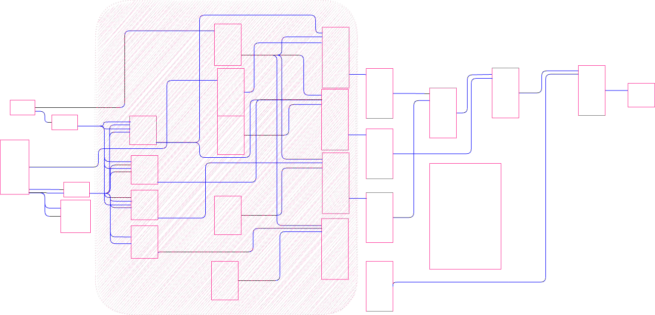
Let’s put input and output ports on the lines where they cross the edges of the marked area.
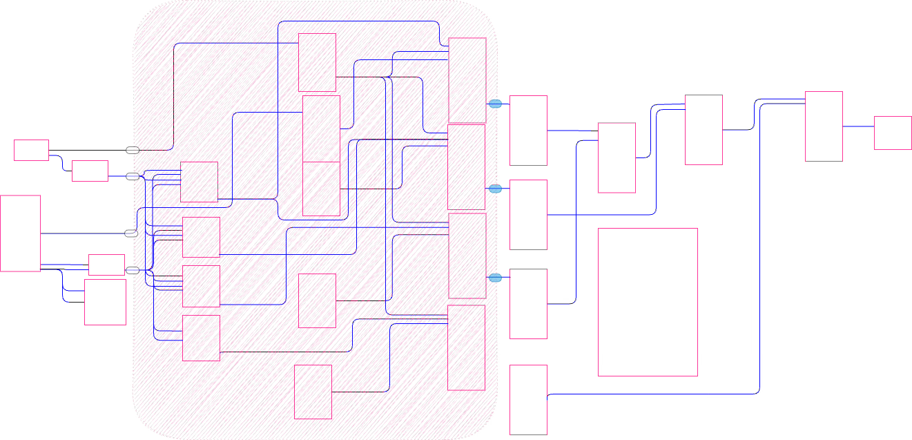
And then move the highlighted area to another Part.

This removes 13 parts from the main diagram and replaces them with 1 part.
The first layer now has 15 parts and the second layer has 13 parts.
The first layer has 19 lines, the second layer has 31 lines (as best as I can count them).
Is that good enough? By strict application of the Rule of 7, no, but, maybe the diagrams are sufficiently expressive as they stand. Only the Software Architect would know for sure.
If I keep going on graphic appearance alone, I see 3 main sections in the first layer and about 4 sections in the second layer.
For purposes of discussion, I’ll reduce the diagram repeatedly until it looks “good enough” to me, based only on visual appearance. Keep in mind that maybe my decomposition makes good Architectural sense or maybe it over-simplifies the architecture.
Here’s my final version. I’ve decomposed the original diagram into 5 layers.
Is this good enough? Does it express the Design Intent better?

Drawing Editor
I’ve been using draw.io to make the drawings.
Draw.io was designed for a different purpose and is one of the least unusable tools available at this time for making drawings of code - to my knowledge.
The main advantage of draw.io is that it stores diagrams in XML format (graphML) and retains connection information.
Using modern parsing tools, like OhmJS or XML parsing libraries, it is possible to convert the diagrams into JSON format which can then be used by many modern programming languages. I’ve tried other editors, like Excalidraw, yEd, which had similar advantages. All editors I tried had some disadvantages. I arbitrarily chose to use draw.io.
It is, also, possible to simply use SVG formatted diagrams and to infer connection information using software. I succeeded in doing such inferencing using ESRAP and CL-HOLM in Common Lisp in a prototype project. I used Prolog (SWIPL) for experimentation.
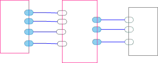
Ports and Gates
In the diagrams in this article, there should be a port figure at every junction of a line and a rectangle. I didn’t bother to draw many such ports, due to the difficulty of doing so with the current drawing editor and the associated necessary fiddling.
Ports are an important semantic concept for structuring code, but, the discussion of ports is not the main thrust of this article.
I differentiate between ports and gates in my diagrams. Ports are used to signify connection points on Parts within diagrams, whereas gates are used to signify data flowing in from the outside or data flowing out to the outside of diagrams. Ports are pill-shaped, gates are rhombuses. Inputs are white in colour, outputs are teal (blue-green) or blue in colour.
Connections
To allow recursively nestable layers, we need to extend our notion of what a connection is.
Usually, one thinks of a wire (a connection) as a pair
Sender
Receiver
To make Parts recursively nestable, we need to consider wires as triples
Direction
Sender
Receiver.
Where direction is one of
Down
Across
Up
Through.
You can treat fan-out as a collection of wires. The wires in a collection must be processed atomically, to maintain message ordering information and to avoid interleaving of messages from other sources.
Why Bother to Make Layers Recursively Nestable?
Recursively nestable Parts don’t get rid of detail, but, do allow Software Architects to rearrange the presentation of the detail so that it doesn’t hit the reader all in one big gulp.
The effect is similar to a zoomable (infinite) canvas, except, that doing it as shown in this article expresses what the Software Architect wants the reader to see at any level. It’s essentially a guided tour conducted by the Software Architect. The reader isn’t left with a question of “where to start?”.
The Software Architect expresses DI - Design Intent - by guiding the reader through a top-down “tour” of the design by presenting detail in successive layers.
The current program development workflow fails to preserve immutability of the layers. For example, OO class inheritance allows the behaviour of upper layers to be changed by layers below them.
It turns out to be quite simple to structure software Parts in ways that isolate them from changes in behaviour. The techniques for doing so only need the use of queues and 1st class functions (e.g. closures) - concepts which are readily available in most modern programming languages.
Emphasizing the importance of DI and readability is a matter of mindset, and, does not involve any special technology.
Further Reading
Rule of 7 is discussed in this old blog post. The blog post mentions Parental Authority which is outlined in this other old blog post. The Rule of 7 blog post also refers to another old blog post regarding Structured Message Passing. That blog post has been refurbished here, as it is no long available at the URL given in the article.
Aside
For the record, I regularly use draw.io to write code using rectangles with ports and arrows. I write about that elsewhere.
See Also
References: https://guitarvydas.github.io/2024/01/06/References.html
Blog: guitarvydas.github.io
Videos: https://www.youtube.com/@programmingsimplicity2980
Discord: https://discord.gg/65YZUh6Jpq
Leanpub: [WIP] https://leanpub.com/u/paul-tarvydas
Gumroad: tarvydas.gumroad.com
Twitter: @paul_tarvydas
Substack: paultarvydas.substack.com